
portfolio detail
Zealous Digital
SEO & AEO

Frank Yao — Zealous Digital Solutions.

Full-service digital agency site engineered to rank for competitive marketing keywords and convert organic traffic into clients.

Next.jsSEOContent StrategyAI Automation
Scroll to explore
+120%

Organic Traffic

Top 5

Keyword Rankings

-35%

Bounce Rate

Zealous Digital
(How We Built It)
01

Challenge

Zealous Digital needed to practice what they preach — ranking their own agency site in a hyper-competitive SEO niche.

02

Approach

Implemented technical SEO best practices, structured data, programmatic SEO pages, and a content-driven architecture built for crawlability.

03

Results

Achieved top-5 rankings for target keywords and a significant increase in organic lead flow.

(Screenshots)
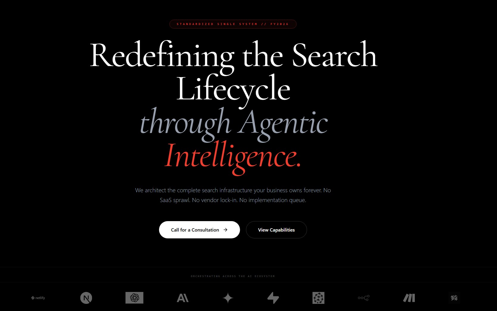
Zealous Digital screenshot 1
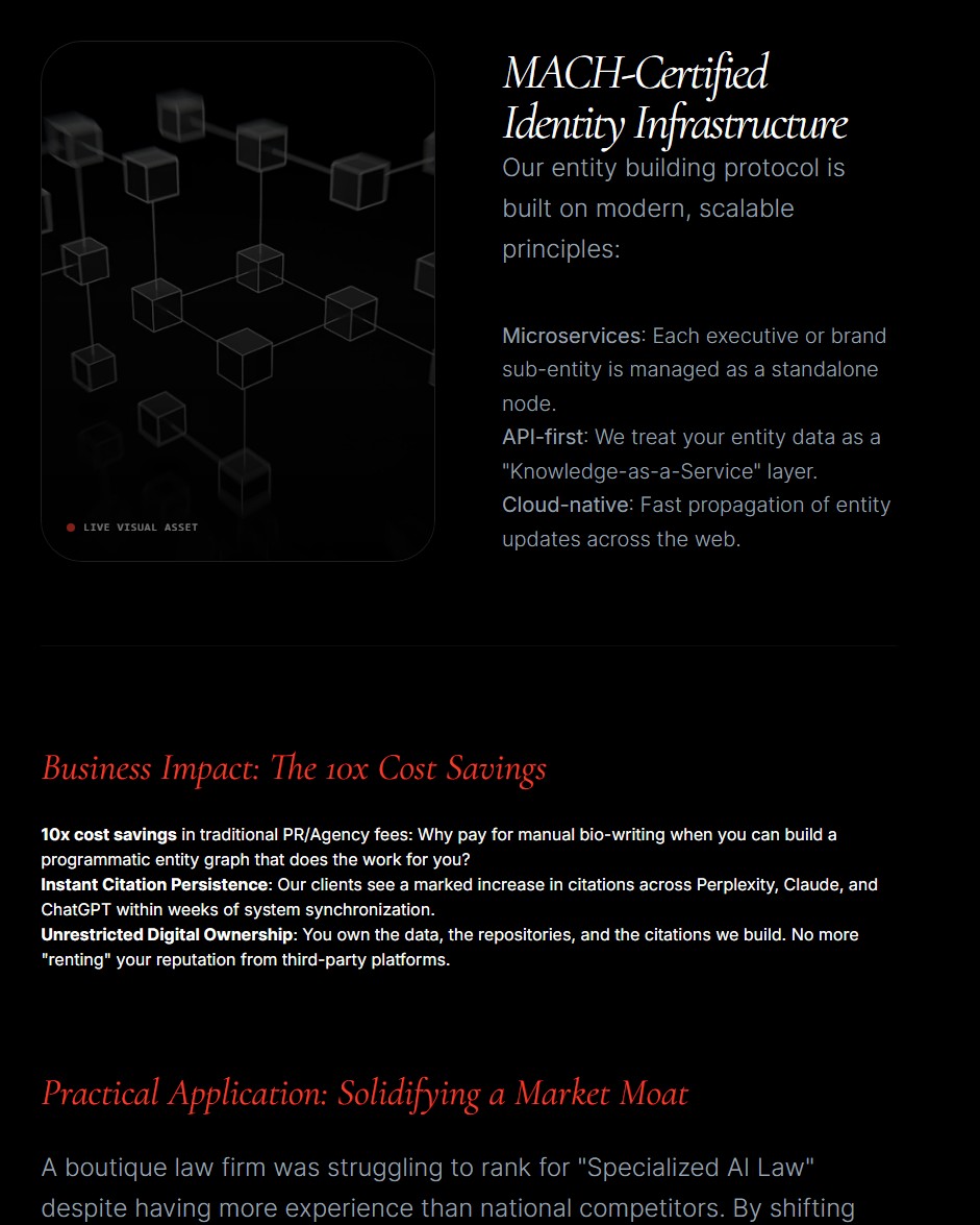
Zealous Digital screenshot 2
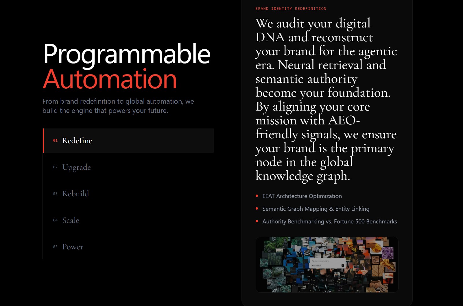
Zealous Digital screenshot 3
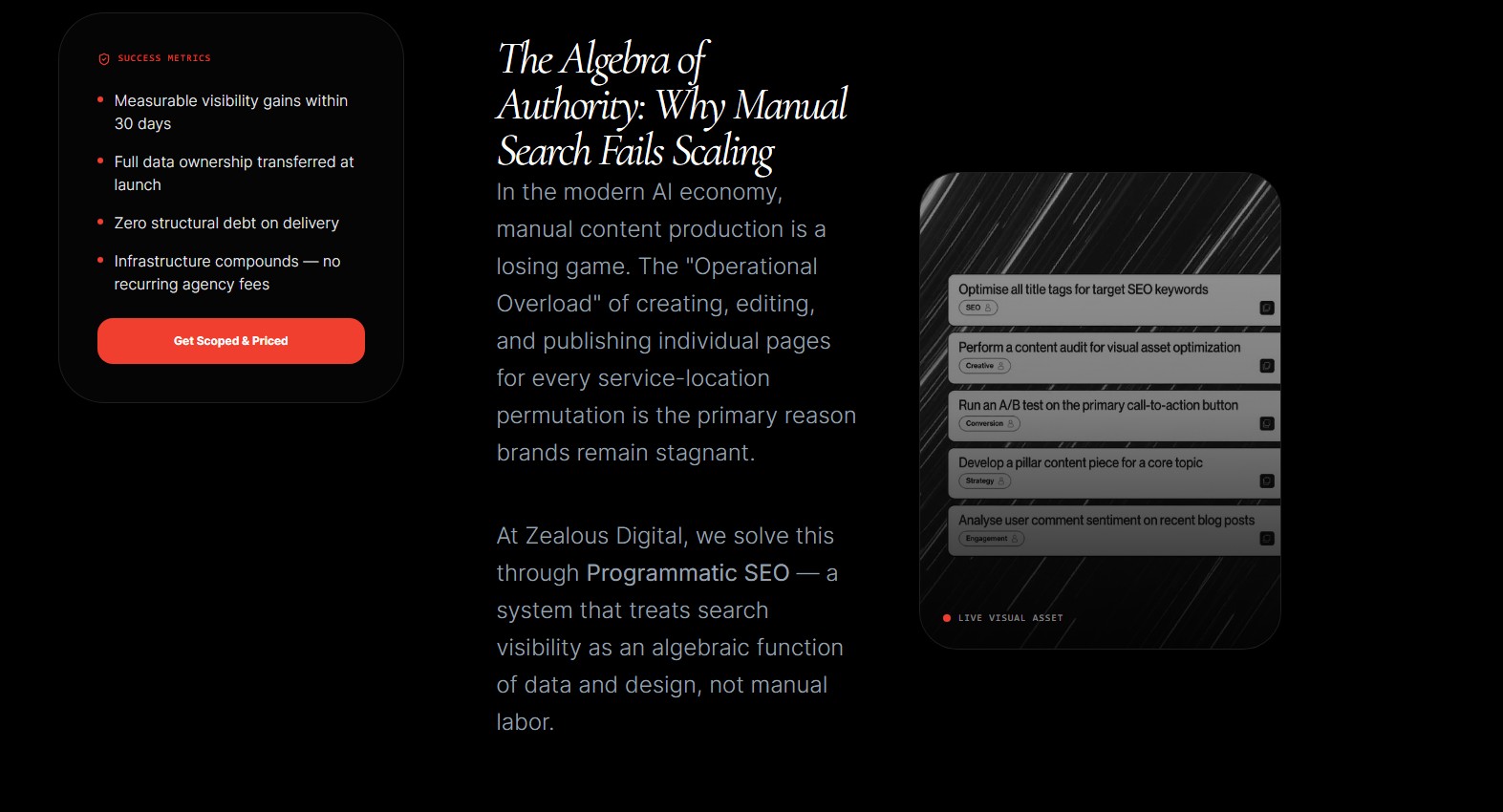
Zealous Digital screenshot 4
Zealous Digital

The full story behind Zealous Digital.

(Case Study)
01

The Problem: A WordPress Site That Couldn't Keep Up

Zealous Digital Solutions had a problem that plagues thousands of digital agencies: their own website didn't reflect the quality of work they delivered to clients. The existing site was built on WordPress with an aging theme, generic stock imagery, and a content workflow that required developer intervention for even basic updates.

The installation had accumulated years of plugin bloat — dozens of active plugins handling everything from SEO to caching to contact forms. Page load times exceeded 4 seconds on mobile. The design looked dated next to the modern, polished sites competitors were shipping. Most critically, the site wasn't generating meaningful organic traffic despite the agency being in the business of SEO.

For an agency that sells digital transformation, a website that looks half a decade old is more than an aesthetic problem — it's a credibility gap. Prospective clients researching agencies would land on the site and immediately question whether the team could deliver modern, high-performing digital products.

Beyond the front end, the content workflow was broken. Publishing a post required coordinating with a developer for formatting, image optimization, and deployment. That bottleneck meant content went out infrequently and inconsistently, undermining the organic strategy.

02

The Migration: From WordPress to a Modern Stack

We rebuilt the entire web presence from the ground up on a modern JavaScript framework deployed to an edge network. The migration was not a reskin — it was a rethinking of how the site should function as a business tool.

The migration involved careful content extraction. We mapped every existing page, post, and service description, cleaned and restructured the content, and reimported it. URL structures were preserved or properly redirected to retain the search equity the existing pages had accumulated.

The new architecture uses server-side rendering for content-heavy pages, so crawlers receive fully rendered HTML with proper semantic markup, structured data, and optimized metadata. Interactive elements use client-side rendering for a responsive, app-like experience.

Performance improved dramatically. The new site loads in under 1.2 seconds on mobile versus 4+ seconds before. Core Web Vitals moved from failing to passing across all metrics, and the Lighthouse performance score consistently hits 95+.

The design language was completely overhauled — from a generic corporate template to a bold, distinctive identity. High-contrast typography, purposeful whitespace, and strategic animation create a site that feels authoritative and modern.

03

A Content Engine Instead of a Publishing Bottleneck

The most transformative part of this project was the content system. It was not simply swapping one CMS for another — it was building a workflow that lets the team publish high-quality content at a pace that traditional setups can't sustain.

Content is stored as structured, composable data rather than locked inside rigid page templates. A post, a case study, a service page — they share a common architecture that can be assembled, repurposed, and cross-referenced automatically. Publishing a new case study surfaces it on the relevant service pages, updates the portfolio grid, and feeds related-content recommendations across the site.

Topic planning is assisted rather than guessed. Research surfaces gaps and opportunities in the agency's niche and turns them into briefs with target keywords, suggested structure, and depth targets. The team reviews the brief, approves it, and writes from a clear strategic foundation.

The pipeline is calibrated for substantive long-form articles rather than shallow posts that barely scratch the surface. Depth is what earns sustained organic rankings.

Routine optimization happens before publication rather than after: metadata is derived from the content, internal links are suggested based on topical relevance, images are compressed and served in modern formats, and structured data is applied based on content type. A human reviews and approves the final output.

The publishing workflow itself eliminated the developer bottleneck. Editors write, preview in real time, and publish with a single click. Changes reach production in under 30 seconds. No developer, no deployment queue, no waiting.

04

Enterprise-Grade Design on an Agency Budget

One of the key objectives was making the site look and feel like it belongs to a much larger operation, through design decisions that maximize perceived quality without an enterprise budget.

The typography system uses a carefully selected type scale that creates clear hierarchy and readability across devices. Headings are set in a bold geometric sans-serif. Body text uses a complementary face optimized for screen reading at length — critical for the deep-coverage content that forms the backbone of the organic strategy.

Animation and interaction design add sophistication that static sites can't match. Page transitions, scroll-triggered reveals, and hover states are tuned for performance so they enhance the experience without adding loading weight. The animations feel intentional, not gratuitous.

The visual system supports both light and dark content sections, creating rhythm as users scroll through long pages. Service pages open with bold dark hero sections that transition into clean content areas. Case studies open with full-bleed imagery.

Responsive design was a first-class concern, not an afterthought. Every component was designed mobile-first and progressively enhanced. With the majority of agency-site traffic arriving on mobile, that ordering matters.

05

Results: A Site That Practices What It Preaches

The impact was immediate and measurable. Organic traffic increased by 120% within the first quarter after launch, driven by improved page experience signals, a fresh content cadence, and the technical foundation built into the architecture.

Target keywords moved into the top 5 for competitive terms in the agency's niche. The combination of performance, content depth, and technical optimization created a compounding effect — as individual pages gained authority, they lifted the domain's overall ranking potential.

Bounce rate dropped by 35%, indicating visitors were finding relevant content and engaging with it rather than bouncing back to search results. Average session duration increased as users explored the interconnected content architecture.

Content velocity increased dramatically. Where the old setup produced one or two posts per month at best, the new system supports consistent weekly publication. Each piece is optimized, interlinked, and structured for long-term search value.

Most importantly, the site now serves as the agency's strongest sales tool. Prospective clients see a modern, high-performing digital product that demonstrates exactly what the team can build for them. The credibility gap that existed with the old site is gone.

Want Something Like This?

Every project starts with a conversation. Tell me the problem — I'll show you the system that solves it.